anura-gallery
<anura-gallery adapter="some-adapter" search="anura-tree"></anura-gallery>The gallery component will show assets in a gri:.
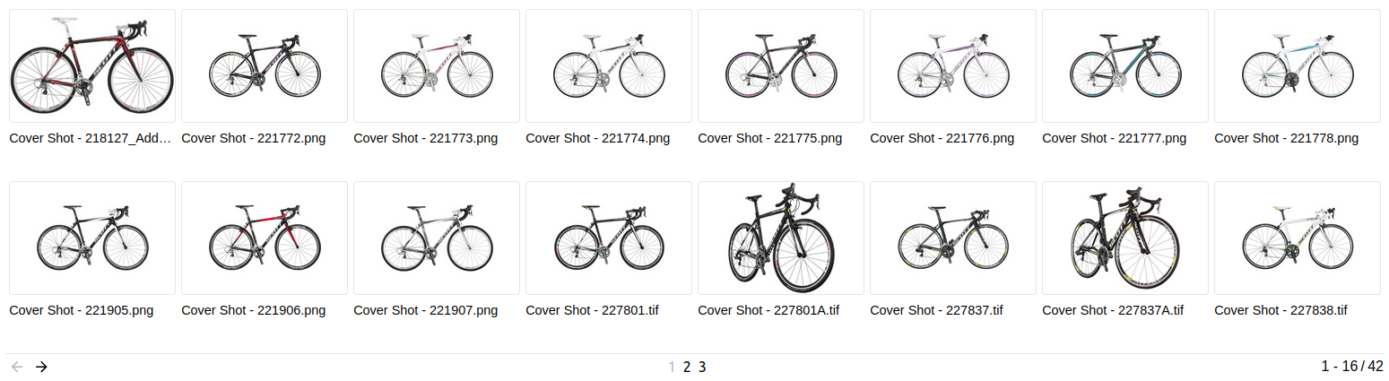
By default, the gallery consists of a number of <anura-asset>s and an <anura-paginator> at the bottom.
Attributes
adapter
required: yes, live: no, default: -
With which adapter to talk to (for translations and suggestions)
<anura-gallery search="#my-adapter"></anura-gallery>
search
required: when no node is provided, live: yes, default: -
Which component the gallery should get its instructions from, e.g.:
anura-treeanura-searchbaranura-select
You can combine multiple search components, e.g. anura-tree,anura-searchbar, which will be ANDed together. Depending on where they live, you may use a selector such as aside > *.
<anura-gallery search="#sidebar > *"></anura-gallery>
node
required: when no search is provided, live: yes, default: -
The content of which node that the gallery should display. This will cause the gallery to ask its adapter for the content of said node.
<anura-gallery node="123"></anura-gallery>
recursive
required: no, live: yes, default: -
When displaying a node, whether the content should also include everything that is contained in subnodes beneath a node.
<anura-gallery recursive="true"></anura-gallery>
sort
required: no, live: yes, default: -
How the displayed assets should be sorted, ending in either _asc or _desc. The exact wording will depend on your adapter, e.g. name_asc. Known values:
- Bynder:
name, dateCreated, dateModified, datePublished - CELUM:
id, name, uploaddate, lastmodified, extension, assettype, score, original(name), (file)size, info_{id}, default isid - pixx.io:
createDate, fileName, fileState, rating, subject, uploadDate - Sharedien:
relevance, file_name, system_import_date, default isrelevance
<anura-gallery sort="name_asc"></anura-gallery>
page-size
required: no, live: on-load, default: 50
How many assets should be displayed at once on a page.
<anura-gallery page-size="42"></anura-gallery>
selected
required: no, live: write-only, default: -
When using the checkbox feature on assets, updates itself with a comma-separated list of assets that currently have the selected state. This value is only written, and not read.
<anura-gallery selected="123,456"></anura-gallery>
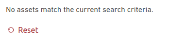
offer-reset
required: no, live: yes, default: true
When a query yields no results, tell the user and offer him an <anura-reset> to start over (translation key: noAssets).
<anura-gallery offer-reset="false"></anura-gallery>
basket
required: no, live: yes, default: -
Where an instance of <anura-basket> can be found to collect assets in, e.g. #my-basket. Attempts auto-detection of anura-basket
<anura-gallery basket="#my-basket"></anura-gallery>
quick-download
required: no, live: on-load, default: -
Which download format to use for the quick download button, e.g. Original. Note that this suppresses the download selection dialog.
<anura-gallery quick-download="Original"></anura-gallery>
lightbox
required: no, live: yes, default: creates one
Where an instance of <anura-lightbox> can be found to display assets in, e.g. #my-lightbox. When none is provided or detected, a "blank" lightbox will be appended to the body. This can be prevented by passing lightbox="false", in which case nothing will happen (for custom actions, use the asset-details event).
<anura-gallery lightbox="#my-lightbox"></anura-gallery>
mode
required: no, live: yes, default: grid
Which display mode to use. Known values:
- grid - assets are placed in a grid with even spacing between the assets
- dense - same as
grid, but no labels are shown, only thumbnails - flex - assets are placed as a flex row
<anura-gallery mode="flex"></anura-gallery>
Events
assets-loading
{details: {node: nodeId, search: search-terms, keepContent: bool, pageRequest: pageRequest}}
When the gallery is loading new assets, either through a node or a search request. A good time to clear counters and such.
assets-loaded
{details: {total: totalCount, assets: AnuraAsset[], pageRequest: pageRequest}}
When assets have been loaded (through whatever mechanism), informs other components (such as anura-paginator) about the total number of assets, the new assets themselves, as well as the pageRequest (contains current paging information).
asset-added
{details: {asset: assetData, instance: elementInstance}}
When an individual anura-asset has been added to the gallery. Useful when you want to tweak something about the asset that you couldn't do via the asset slot.
asset-selection
{details: selectedAssets}
When a change to the selected assets occurs and the component updates its selected attribute.
paginate (inbound)
pageNumber
Instruct anura-gallery to display the provided page number - used by anura-paginator to tell the gallery to advance to an arbitrary page. Note that the page number is currently not validated, so sending a non-existent page number may lead to undefined behaviour.
asset-details
{details: {asset: assetData}}
When an individual anura-asset has been clicked on. By default this triggers the <anura-lightbox> unless lightbox="false" is set.
Slots
-
header - the header slot will appear before the gallery.
-
footer - the footer slot will appear at the very end.
-
asset - configure your own asset. Default is
<anura-asset><anura-gallery adapter="some-adapter"> <anura-asset slot="asset" buttons="download,details"></anura-asset> </anura-gallery> -
paginator - configure your own paginator. Default is
<anura-paginator><anura-gallery adapter="some-adapter"> <anura-paginator slot="paginator" mode="auto" detect-scroll="false"></anura-paginator> </anura-gallery>
When using the built-in components, the part selector might be
anura-gallery::part(paginator-button), but when you declare your own it changes toanura-paginator::part(paginator-button), as it is no longer part of the gallery.
Parts
<div part="asset-container">
    <!-- many <anura-asset>s -->
</div>
<slot name="asset">
    <anura-asset></anura-asset>
</slot>
<slot name="paginator">
  <anura-paginator part="paginator"></anura-paginator>
</slot>
© brix Solutions AG