Examples
Assembly
A fully assembled demo page, featuring a tree and a gallery (with something configured in every slot)
<!DOCTYPE html>
<html lang="en">
<head>
    <title>Anura Webcomponents Example</title>
    <meta http-equiv="Content-type" content="text/html;charset=UTF-8">
    <meta name="viewport" content="width=device-width, initial-scale=1">
    <script type="module" src="adapters/some-adapter.js"></script>
    <script type="module" src="components/anura-components.js"></script>
</head>
<body>

<some-adapter url="https://my.server.io/api" locale="de"></some-adapter>

<div style="display: flex">
    <aside aria-label="Navigation">
        <anura-tree adapter="some-adapter" show-root="true" depth="1" root="1737" selected="1738" icon="archive"></anura-tree>
    </aside>
    <main aria-label="Gallery">
        <anura-counter parent="anura-gallery"></anura-counter>
        <anura-gallery adapter="some-adapter" search="anura-tree" page-size="32">
            <anura-asset slot="asset" buttons="download,checkbox,info" quick-download="1"></anura-asset>
            <anura-paginator slot="paginator" mode="auto" detect-scroll="false"></anura-paginator>
        </anura-gallery>
        <anura-lightbox buttons="fullscreen,sidebar,close">
            <anura-details slot="sidebar" allowlist="id,name,info_102,info_103"></anura-details>
        </anura-lightbox>
    </main>
</div>
</body>
</html>
View switcher
Offer different view components for the same content. The key here is to set the other views as disabled.
<some-adapter url="https://my.server.io/api" locale="de"></some-adapter>

<select id="demo-switcher">
    <option value="anura-gallery">Gallery</option>
    <option value="anura-table">Table</option>
    <option value="anura-map">Map</option>
</select>

<anura-gallery adapter="some-adapter" source="omitted" class="main-view"></anura-gallery>
<anura-table   adapter="some-adapter" source="omitted" class="main-view" disabled></anura-table>
<anura-map     adapter="some-adapter" source="omitted" class="main-view" disabled></anura-map>

<script>
    document.querySelector('#demo-switcher').addEventListener('change', e => {
        document.querySelectorAll('.main-view').forEach(view => view.setAttribute('disabled', ''));
        document.querySelector(e.target.value).removeAttribute('disabled');
    });
</script>
Disabled components do not react to source updates (and get aria-hidden).
Once re-enabled, the sources are queried again to update the content.
Hidden search restrictions
In order to scope all search requests to a particular subsection of your DAM, you can declare <input type="hidden"> along your other <anura-xyz>, e.g. to only show assets below node 123:
<aside id="my-search">
    <anura-searchbar some="options">
    <anura-select more="options">
    <anura-select more="options">
    <input type="hidden" value="search_node=123"><!-- the exact syntax of "value" will depend on your DAM -->
</aside>
<anura-gallery search="#my-search > *">
(again, please use permissions to restrict what the user has access to in general, as it would be trivial to simply remove the <input>)
Some adapters take separate attributes for the source, operator and the value, e.g. <input type="hidden" source="some_field" op="Equals" value="true">
Events
Many components generate events when you interact with them. Here's an example of how to a custom action when an asset is clicked upon (instead of the traditional lightbox).
<anura-gallery adapter="some-adapter" lightbox="false"></anura-gallery>

<script>
    document.querySelector('anura-gallery').addEventListener('asset-details', e => {
        alert(`You clicked on "${e.detail.asset.name}" (ID: ${e.detail.asset.id})`);
    });
</script>
Button Slots
anura-asset and anura-lightbox both offer a slot called buttons where you can place custom buttons. Let's add one for each inside of a gallery (with a simple alert()):
<anura-gallery adapter="some-adapter">
    <anura-asset slot="asset" buttons="basket,info">
        <span slot="buttons">
            <button onclick="alert('Asset '+this.value)" title="demo" style="background: none; border: none; padding: 0">
                <anura-icon icon="alert-triangle"></anura-icon>
            </button>
        </span>
    </anura-asset>
</anura-gallery>
<anura-lightbox buttons="basket,sidebar,close">
    <span slot="buttons">
        <button onclick="alert('Lightbox asset '+this.value)" title="demo" style="background: none; border: none; padding: 0; margin: 1.5rem">
            <anura-icon icon="alert-triangle"></anura-icon>
        </button>
    </span>
</anura-lightbox>
Note how the value of the click event provides you the ID of the current asset. We'd also advise to use an anura-icon inside for consistency.
Dynamic endpoints
Suppose you are using the same layout, but various endpoints to display different assets, depending on a URL parameter.
Let's say https://my.page.com/products.html#sales-country=ch and https://my.page.com/products.html#sales-country=de
Due to the nature of the adapters, they will require their URL to be set when they load, which you can achieve with:
<some-adapter url="https://my.server.com"></some-adapter>
<script>
  customElements.whenDefined('some-adapter').then(() => {
    const adapter = document.querySelector('some-adapter');
    const baseUrl = adapter.getAttribute('url'); // = 'https://my.server.com'
    adapter.setAttribute('url', `${baseUrl}/anura/${adapter.getState('sales', 'country')}`);
  });
</script>
... this will set the url attribute to https://my.server.com/anura/ch or https://my.server.com/anura/de depending on #sales-country.
Content Slot (string interpolation)
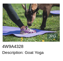
anura-asset offers a content slot to put additional information, be that asset markers (aka bullets) or more text.
The following snippet demonstrates both, the span creates a file extension bullet "JPG", the p adds a description line beneath (taken from a metadata field of that name):
<anura-gallery ...>
    <anura-asset slot="asset" ...>
        <span slot="content">
            <span class="asset-marker" style="color: white; position: absolute; bottom: 37%; right: 3%; background: rgba(0, 34, 51, 0.4); padding: 2px 5px; border-radius: 2px; font-size: 0.8rem; text-transform: uppercase;">
                ${asset.fileExtension}
            </span>
            <p if="${asset.metadata[description].value}" class="description" style="font-size: 85%; margin: 0.25rem 0;">
                ${asset.metadata[description].name}: ${asset.metadata[description].value}
            </p>
        </span>
    </anura-asset>
</anura-gallery>
Depending on your adapter, you'll need to tell it to fetch those fields first (e.g.
infofields=...orload-properties=...)
Note how you can add an if attribute to any sub-node, so that you don't get a "Description: " with no actual value to display (removes the node when empty). This yields:
While if simply checks if any value is present, you may also use equals and contains as conditional attributes, e.g.
<span if="${asset.metadata[copyright].value}" contains="copyrighted">
    <img src="img/copyright-symbol.svg">
</span>
If you're stuck, turn on DEBUG in your browsers console to see what's going on
Interpolating 'asset.metadata[description].value' on ⏵ Object { asset: {…} }
Interpolation on the following attributes is supported:
- title
- alt
src(deprecated, browser may try to load it before interpolation, use set-src instead)- set-src (sets
srcwhen processed) - set-href (sets
hrefwhen processed)
Post-processing
A small set of post-processing commands are available through the | symbol, e.g. ${asset.metadata[description].value | trim}. Known commands:
- split - expects 2 arguments, the separation character and which part you'd like back (zero-based). Suppose you only need the first sentence in
asset.metadata[description].value, you'd write${asset.metadata[description].value | split . 0}. - trim - trims excessive whitespace from wither end of a string (takes no arguments).
- date - formats a date string or timestamp, e.g.
${asset.metadata[aDate].value | date yyyy-MM-dd}or${asset.metadata[aDate].rawValue | date yyyy/MM} - bytes - formats bytes in a human readable format, e.g.
${asset.metadata[aSize].value | bytes 2}could yield3.58 MB - urlencode - URL-encodes the content via
encodeURIComponent, since 2026-01-12
Advanced users can programmatically register custom post-processors on the adapter through the registerPostprocessor(name, func(value, args)) method, e.g. adapterInstance.registerPostprocessor('uppercase', (value, args) => value.toUpperCase());
Variable Scopes
When changing a variable, it may be necessary to inform more than one party. This is a limitation of parts and can be addressed by telling both components (in this case anura-gallery and the anura-asset inside of it):
anura-gallery, anura-gallery::part(anura-asset) {
    --asset-width: 15rem;
    --asset-height: 15rem;
}
Variables + Parts + String Interpolation
To demonstrate what you can achieve through variables, parts and string interpolation, suppose we want a gallery with wide assets, in order to show more details upfront. In other words, we want to go from this:
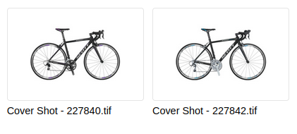
... to this:
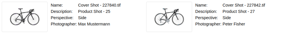
Which we can easily achieve using 2 variables, 3 parts and 4 table rows:
<head>
    <script type="module" src="components/..."></script>
    <style>
        anura-gallery, anura-gallery::part(anura-asset) {
            --asset-width: 25rem; /* change aspect ratio */
            --asset-height: 8rem;
            flex-direction: row; /* move content to the right */
        }
        anura-gallery::part(asset-figure) {
            width: 33%; /* shrink the thumbnail */
            margin-right: 2%;
            height: 100%;
        }
        anura-gallery::part(asset-title) {
            display: none; /* no figcaption */
        }
    </style>
</head>
<body>
    <some-adapter url="https://..." infofields="127,128,160"></some-adapter>
    <anura-gallery adapter="some-adapter">
        <anura-asset slot="asset">
            <span slot="content">
                <table style="font-size: 90%">
                    <tr>
                        <td>Name:</td>
                        <td>${asset.name}</td><!-- interpolate ${} -->
                    </tr>
                    <tr if="${asset.metadata[info_160].value}"> <!-- hide the row if value is empty -->
                        <td>${asset.metadata[info_160].name}:</td>
                        <td>${asset.metadata[info_160].value}</td>
                    </tr>
                    <tr if="${asset.metadata[info_128].value}">
                        <td>${asset.metadata[info_128].name}:</td>
                        <td>${asset.metadata[info_128].value}</td>
                    </tr>
                    <tr if="${asset.metadata[info_127].value}">
                        <td>${asset.metadata[info_127].name}:</td>
                        <td>${asset.metadata[info_127].value}</td>
                    </tr>
                </table>
            </span>
        </anura-asset>
    </anura-gallery>
</body>
Asset Picker
Suppose you have a CMS, which you want to enrich with content from a DAM. Here's a simple asset picker:
<!DOCTYPE html>
<html lang="en" class="fixed">
<head>
    <title>Anura Webcomponents: Picker Demo</title>
    <meta http-equiv="Content-type" content="text/html;charset=UTF-8">
    <meta name="viewport" content="width=device-width, initial-scale=1">
    <script type="module" src="../src/adapters/some-adapter.js"></script>
    <script type="module" src="../src/components/anura-components.js"></script>
    <style>
        html, body { font-family: Arial, sans-serif; --button-color: #232d5a; --button-font-color: white; --selected-color: #232d5a;}
        button { background: var(--button-color); color: var(--button-font-color); border: none; padding: 0.5em 1em; margin: 0 0.5em; border-radius: 0.25em; cursor: pointer;}
        button:disabled { opacity: 0.5; cursor: not-allowed; }
        a, a:visited { color: var(--button-color); text-decoration: none; }
    </style>
</head>
<body>
<header>
    <h1>Anura Webcomponents: Picker Demo</h1>
</header>

<some-adapter url="https://some.server.com" token="*snip*"></some-adapter>

<anura-modal trigger="#picker-button">
    <span slot="title">Asset Picker</span>
    <div id="content" style="height: 100%">
        <aside aria-label="Navigation">
            <anura-searchbar adapter="some-adapter"></anura-searchbar>
            <anura-counter parent="anura-gallery"></anura-counter>
            <anura-select adapter="some-adapter" source="Season" radio="true"></anura-select>
            <anura-select adapter="some-adapter" source="Location"></anura-select>
            <anura-select adapter="some-adapter" source="Copyright" hide-empty="true"></anura-select>
            <anura-reset adapter="some-adapter" target="aside > *" ></anura-reset>
        </aside>
        <main aria-label="Gallery">
            <anura-gallery adapter="some-adapter" search="aside > *" lightbox="false">
                <anura-asset slot="asset" buttons="checkbox"></anura-asset>
            </anura-gallery>
        </main>
    </div>
    <div slot="footer" style="display: flex; flex-direction: row-reverse">
        <button id="confirm-button" disabled style="margin: 0.75em">Confirm selection</button>
    </div>
</anura-modal>

<button id="picker-button">Pick some assets</button>
<p id="result" style="padding: 1em">No assets yet</p>

<script>
  const gallery = document.querySelector('anura-gallery');
  const modal = document.querySelector('anura-modal');
  const confirm = document.querySelector('#confirm-button');
  const adapter = document.querySelector('some-adapter');
  const result = document.querySelector('#result');

  confirm.addEventListener('click', () => {
    result.innerText = 'You picked: ';
    gallery.getAttribute('selected')?.split(',').forEach(id => {
      adapter.getAssetDownloadUrl(id).then(url => { // getAssetDownloadUrl may be skipped if you have a CDN or similar
        result.innerHTML += `<p>👉 <a href="${url}">Asset ${id}</a></p>`; // pretend to do something with the selection

        // example for getting metadata from the selected asset:
        // adapter.loadMetadata(id, {asFlatArray: true}).then(metadata => console.log(metadata));
      });
    });
    gallery.selectAll(false);
    modal.toggle();
  });
  gallery.addEventListener('asset-selection', e => confirm.toggleAttribute('disabled', e.detail === '')); // enable confirm
  gallery.addEventListener('asset-details', e => e.detail.instance?.setAssetSelected()); // checkbox proxy for convenience
</script>
</body>
</html>
Custom translations
In general, everything comes from the DAM you are connected to, but there are a few exceptions, e.g. for the label of the 'close' button (see adapter/translations.js). You can override these like so:
<script>
  customElements.whenDefined('some-adapter').then(() => {
    document.querySelector('some-adapter').setTranslation({
      'de': {'close': 'und trüss'},
      'en': {'close': 'bye bye'},
    });
  });
</script>
Custom icons
We use feathericons by default. But you can override them like so:
<script>
  customElements.whenDefined('anura-icon').then(AnuraIcon => {
    AnuraIcon.setSvg('chevron-up', '<g transform="scale(.025) translate(0 960)"><path d="m296-371.92-28.308-28.308 212.31-212.31 212.31 212.31-28.308 28.308-184-184-184 184z" fill="currentColor"/></g>');
    AnuraIcon.setSvg('chevron-down', '<g transform="scale(.025) translate(0 960)"><path d="M480-371.923 267.692-584.231 296-612.539l184 184 184-184 28.308 28.308L480-371.923Z" fill="currentColor"/></g>');
  });
</script>
© brix Solutions AG