Miscellaneous
This is the old front-end written in jQuery. Please consider upgrading to Webcomponents. We will still maintain this version, but new features will only be added to the new one.
Details
Options
Please use anura-details instead
server
type: URL, required: yes, default: -
The endpoint to use, e.g. http://your.celum.server/anura/first
locale
type: String, required: no, default: CELUM's default language
The locale (ISO 639-1) to use, i.e. en. The availability of these depend on your CELUM configuration, usually en, de or fr. When left empty, CELUM's default language will be used.
asset
type: long, required: yes
The ID of the asset you wish to see the details of.
locale
type: String, required: no, default: CELUM's default language
The locale (ISO 639-1) to use, i.e. en. The availability of these depend on your CELUM configuration, usually en, de or fr. When left empty, CELUM's default language will be used.
show
type: List of String , required: no, default:
['general','infofields','downloads']
What sections to show, and in what order. Any of:
general- general information about the asset, such as name, type and size (unordered)infofields- information fields of the asset (no field-sets, unordered)keywords,keyword_links,keyword_paths,keyword_path_links- DEPRECATED (useinfofieldsormetadata)share- add a button to share the current detail view as a deep linkdownloads- links to all available download formats (and "add to basket" when you configure one)pages- adds a page navigator for documents - DEPRECATED (use pdfPreviews instead)links- show linked assets (through one definable relation type) - DEPRECATED (userelations)relations- show related assets in a full-blown main view. Configurable through the relations setting. Since 2.9.similar- show similar assets (does a search on the nodes that the current asset is assigned to)metadata- shows a fully configurable mix of the fields that are available ingeneralandinfofields(see metadata)versions- shows a list of previous versions of this asset, with the ability to open it in the lightbox or to download it (via downloadFormat)public_urls- lists public URLs of this asset, since 2.9.38get_reviews- shows a list of all existing asset reviews (requires a review provider)post_reviews- add a component to create new asset reviews (requires a review provider)function (asset_id, metadata, table, options) {}- custom section (.append to the table you get)
alternative_name
type: long, required: no, default: 0
An information field ID to display instead of the asset name in the related assets (links).
send
type: long, required: no, default: false
The download format ID to use in the "Send hyperlink" link or false to disable that feature.
split
type: boolean, required: no, default: false
Whether to use separate tables for the different sections.
callback
type: function, required: no, default: null
Callback when anuraDetails has finished loading: function(options, data) {...}
download_directly
type: boolean, required: no, default: true
Whether to show the individual download formats as links. Turning this off will only leave the basket.
download_relations
type: boolean, required: no, default: false, since: 2.9
Offers a link to download all related files of an asset (e.g. images used in a layout file) as a ZIP.
show_dlf_description
type: boolean, required: no, default: true
Whether to show the description of the download formats on an extra line instead of just as a tooltip.
icon_transform
type: boolean, required: no, default:
function(icon) {return icon.replace('/big/', '/small/')}
Transforms the download format icon URLs, useful for dark themes to transform light into dark.
paginator_target
type: Object, required: no, default:
'#cboxContent .cboxPhoto'
Where to update th page previews pages is enabled.
paginator_nav
type: Object, required: no, default:
{prev: '←', next: '→'}
Customize the buttons used on the pages paginator, e.g. {prev: '<', next: '>'}
infofield_transform
type: map of functions, required: no, default: {}
Enables you to manipulate the values of an information field (per infofield ID), e.g. {3: function(info) {return 'Hello '+info.value+'!'}}
infofield_sort
type: function, required: no, default: function(a, b) {return a.name.localeCompare(b.name, undefined, {numeric: true, sensitivity: 'base'})}
DEPRECATED - custom sorting function for the infofields section. You'll probably want to use metadata instead.
metadata
type: List of String, required: no, default: true
What metadata fields to show when show contains metadata. This is a replacement for general and infofields where you can determine what shows up and in what order.
The keys are identical to the classes given to the rows in the general/infofields sections, e.g. ['id', 'created', 'info_102'] and are also usually identical to the blacklist items. (since 2.8)
relations
type: Object, required: no, default:
{type: null, view: 'anuraGallery', view_settings: {}}
When displaying related assets, a full-blown main view is loaded into the details pane. It's mostly self-configuring, but you may want to provide additional configuration.
type: what relation type to fetch. Defaults tonullwhich fetches all relation types.view: which main view to use, defaults toanuraGalleryview_settings: additional settings for that view, see main view configs.
share_transform
type: function, required: no, default: inherited from the lightbox (if any)
Allows you to monkey with the share URL, e.g.
share_transform: function (url, asset) {
    return window.location.protocol +'//'+ window.location.host + window.location.pathname + '#asset=' + asset;
}
Events
- anura-loaded (options, data) - triggered when the plugin has loaded all the detail information
DOM
<div class="anura-details-container">
   <table class="anura-table-0">
      <tbody>
         <tr class="title general">
            <td colspan="2">Object Details</td>
         </tr>
         <tr class="general">
            <td class="anura-name">Name</td>
            <td class="anura-value">Athene Cunicularia</td>
         </tr>
         <tr class="general"><!--etc--></tr>
         <!--etc-->
         <tr class="title infofields">
            <td colspan="2">Information Fields</td>
         </tr>
         <tr class="infofield">
            <td class="anura-name">Description</td>
            <td class="anura-value">A Burrowing Owl near Goiânia, Goiás, Brazil. It is standing on one leg</td>
         </tr>
         <tr class="infofield"><!--etc--></tr>
         <!--etc-->
         <tr class="title download">
            <td colspan="2">Download Formats</td>
         </tr>
         <tr class="basket">
            <td colspan="2">
               <a class="anura-details-download">
                  <div class="basket-img"></div>
                  <div class="anura-details-download-name">Add to basket</div>
               </a>
            </td>
         </tr>
         <tr class="dlf">
            <td colspan="2">
               <a class="anura-details-download">
                  <img src="...">
                  <div class="anura-details-download-name" title="Original Format">Original Format</div>
               </a>
            </td>
         </tr>
         <tr class="dlf"><!--etc--></tr>
         <!--etc-->
      </tbody>
   </table>
</div>
Basket
Please use anura-basket instead
Options
The basket functionality is available in all main views and the detail view. Use this object for their basket-parameter.
If your basket target element contains a span (preferably with the class
counter), the number of assets in the basket will be updated there,
i.e.<div id="anura-basket">Basket (<span class="counter">7</span>)</div>
server
type: URL, required: yes, default: -
The endpoint to use, e.g. http://your.celum.server/anura/first
locale
type: String, required: no, default: CELUM's default language
The locale (ISO 639-1) to use, i.e. en. The availability of these depend on your CELUM configuration, usually en, de or fr. When left empty, CELUM's default language will be used.
add
type: array of long, required: no, default: -
A list of asset IDs to be added to the basket
remove
type: array of long, required: no, default: -
A list of asset IDs to be removed from the basket
action
type: String, required: no, default: -
Action to perform, one of show, hide, toggle, clear
force_zip
type: boolean, required: no, default: false
Whether to always produce a ZIP file, even for single file downloads
cookies
type: boolean, required: no, default: true
When jquery.cookies.js is available, persist the basket's content through the use of cookies
send
type: boolean, required: no, default: false
Whether to enable the "send" option - this generates a direct download link for others to download the content of your basket. If instead you want to send the same link that the "share" option generates, pass 'share' instead of a boolean (since 2022-04-22)
pin
type: String, required: false, default: -, since: 2.9
What PIN functionality to offer, one of link (opens the PIN in the browser) or send (opens your mail client).
To use this feature, anura.1.createPinParentNodeId MUST be configured.
pin_dropdown
type: Array of Objects, required: false, default: [], since: 2.9.36
When pin is enabled, adds a dropdown next to the PIN button to override the download formats of the PIN. E.g.
pin_dropdown: [
  {title: {de: 'Originalformat', en: 'Original Format'}, formats: [1]},
  {title: {de: 'JPG und Druck', en: 'JPG and Print'}, formats: [6, 7]}
]
share
type: boolean, required: false, default: false
Whether to enable the "share" option - this generates a link that will fill the recipient's basket with the assets in your basket. Note that this is only useful if the recipient also has access to the front-end.
terms_and_conditions
type: object, required: false, default: -
When defined, show these terms and conditions before proceeding with the download.
{title: 'Terms and Conditions', text: 'Lorem ipsum ....', confirm: 'I agree'}- you can omit the
confirmtext in order to suppress the confirmation checkbox - you can just pass
trueinstead of the object, this will then query CELUM's downloadFormatInterceptor texts. - you can localize the texts by passing a map locale->string instead, e.g.
title: {en: 'Terms of use', de: 'Nutzungsbedingungen'}
You can also pass two callbacks in the object:
- show:
function() {return true; /*optional callback if terms should be shown, e.g. based on infofields*/} - confirmed:
function() {/*callback when user has confirmed terms*/}
icon_transform
type: function, required: no, default:
function(icon) {return icon.replace('/big/', '/small/')}
A function to manipulate the download format icon paths, e.g.
```function(icon) {return icon.replace('/dark/', '/light/')}```clear_after_download
type: boolean, required: no, default: true
Whether to clear the basket after initiating a download
require_email
type: boolean, required: no, default: false
Require the user to enter his email address before downloading. Only useful in combination with a downloadHandler.
show_description
type: boolean, required: no, default: true
Whether to show the download format description
max_assets
type: int, required: no, default: -, since: 2.8
Limit the number of assets that can be placed in this basket (FIFO). 0 disables this feature.
show_failed
type: boolean, required: no, default: false
Whether to show placeholders for assets that can't be downloaded
default_format
type: long, required: no, default: -, since: 2.8
The download format that should be selected by default (when available).
alternative_name
type: Object, required: no, default: -, since: 2.9.19
Whether to use an alternative name (from an information field) instead of the asset name.
alternative_name: {id: 105 /*information field ID*/}DOM
<div id="anura-basket-overlay">
   <div class="anura-basket-popup anura-locale-">
      <div class="anura-basket-popup-titlebar"><span>×</span></div>
      <div class="anura-basket-thumbs">
         <div class="anura-basket-thumb"><img src="...">
            <div class="anura-basket-thumb-delete hover"></div>
         </div>
         <div class="anura-basket-thumb"><!--etc--></div>
         <!--etc-->
      </div>
      <div class="anura-basket-download">
         <h3 class="anura-basket-download-title">Download:</h3>
            <div class="anura-basket-download-holder">Download Format X</div>
            <div class="anura-basket-download-holder"><!--etc--></div>
            <!--etc-->
         <h3 class="anura-basket-download-send">Send:</h3>
            <div class="anura-basket-download-holder mailto">Send Hyperlink</div>
         <span class="anura-basket-reset">clear</span>
      </div>
   </div>
</div>
Events
- anura-loaded (options) - triggered when the plugin has loaded all the detail information
- anura-asset-added (options, asset, metadata) - triggered when an asset is added to the basket
- anura-asset-removed (options, asset) - triggered when an asset is removed to the basket
- anura-asset-failed (options, asset) - triggered when an asset could not be added to the basket
- anura-cleared (options) - triggered when the basket is cleared (i.e. all assets got removed)
- anura-toggled - triggered when the basket popup is toggled (i.e. shown or hidden)
- anura-download (asset, download format) - triggered (on the entire window) for each downloaded asset
Add all
There's a separate little helper-module to create a link/button that adds all assets of the current view (even if it's paginated) to the basket. If you need that functionality, import jquery.anura.basket-add-all.js as well.
Provided your main view is in a variable called view and the basket is in basket, the setup is simply
<a id="anura-basket-add-all"> add all (<span class="anura-counter"></span>)</a>$('#anura-basket-add-all').anuraBasketAddAll({
mainView: view,
basket: basket
});mainView
type: object, required: yes, default: -
The main view component to get the assets from, e.g. var view = $('#something').anuraGallery({...});
basket
type: object, required: yes, default: -
The basket component to put the assets into, e.g. var basket = $('#my-basket').anuraBasket({...});
hide_empty
type: boolean, required: no, default: true
Hide the this container when there are no results in the main view.
limit
type: long, required: no, default: 0
Limits the number of assets that will be put in the basket, regardless of how many more there are. 0 = unlimited.
Lightbox
Please use anura-lightbox instead
Since 2.9, anura ships with its own lightbox, as all the other ones have their own quirks. Other lightboxes are still supported for now, but we'd encourage you to use this one :-)
| Dark | Light | Mobile |
|---|---|---|
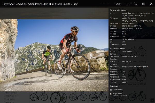 |
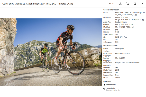 |
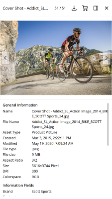 |
Options
server
type: URL, required: yes, default: -
The endpoint to use, e.g. http://your.celum.server/anura/first
locale
type: String, required: no, default: CELUM's default language
The locale (ISO 639-1) to use, i.e. en. The availability of these depend on your CELUM configuration, usually en, de or fr. When left empty, CELUM's default language will be used.
trigger
type: String, required: no, default:
'a[rel^=anura-lightbox]'
The elements that when clicked open the lightbox.
Note that it expects the attributes data-asset-id, src and title to be set on the trigger elements (this is taken care of by all main views that we ship).
toolbar
type: object, required: no, default:
{available: true, visible: true, layout: ['title', 'counter', 'download', 'basket', 'sidebar', 'close']}
Whether to show a toolbar, if said toolbar is visible by default, and what buttons are present on the toolbar.
Known sub-options:
- available (bool) - whether the toolbar is provided at all, default is
true - visible (bool) - whether the toolbar is visible by default, default is
true - layout (Array) - which buttons to show, and in what order, default is
['title', 'counter', 'download', 'basket', 'sidebar', 'close']. Known buttons:title- the title of the asset, as defined by the title attribute of the triggercounter- which asset you're on, e.g. "7 / 50"share- copies a deep link to your clipboarddownload- download the asset directly from the lightboxfullscreen- makes the preview image go fullscreentheme- makes the preview image go fullscreenbasket- offers the usual "add to basket" functionality. Requires basket to be set.sidebar- let's you toggle the visibility of the sidebartheme- let's you toggle the visibility of the sidebarprev- adds a 'previous'-button, usefull if you have navigation.buttons disablednext- adds a 'next'-button, usefull if you have navigation.buttons disabledslideshow- adds a 'slideshow' button to show the next asset in x seconds (default: 5s)close- closes the lightbox. Note that the close button will be auto-added when you specified none.carousel- toggle the visibility of thecarousel(if that is enabled)- function - pass an arbitrary function for custom features -
function(options, toolbar)
sidebar
type: object, required: no, default:
{available: true, visible: true, settings: {}, callback: function, width: '30%'}
Whether to show the sidebar, if the sidebar is visible by default, what happens inside the sidebar, and how wide it should be.
Known sub-options:
- available (bool) - whether the sidebar is provided at all, default is
true - visible (bool) - whether the sidebar is visible by default, default is
true - settings (object) - settings to pass on to the sidebar, usually anuraDetails
- callback (function(options, sidebar, asset)) - called whenever the sidebar opens or the next asset is displayed. Responsible for filling the sidebar with content. Default is
sidebar.anuraDetails($.extend({}, options.sidebar.settings, {server: options.server, locale: options.locale, basket: options.basket, asset: asset})) - width (CSS) - how wide the sidebar should be, default is
30%. Note that in the mobile view it will change to100%.
basket
type: jQuery object, required: only when using 'basket' in toolbar, default: null
The download basket to use where the user can collect assets to download, as returned by your $.anuraBasket()-call.
This enables the corresponding basket buttons in the download_menu and detail_view. Required when you used basket in the toolbar layout.
carousel
type: object, required: no, default:
{available: false, visible: false}, since 2.9.22
Whether to show a carousel of the previous/upcoming assets beneath the current preview

downloadFormat
type: long, required: only when using 'download' in toolbar, default: 1 (original)
Which download format to use for the "download" button - choose one that is available for all file types.
navigation
type: object, required: no, default:
{buttons: true, click: true, keyboard: true}
Which navigation types to enable. Known sub-options:
- buttons (bool) - adds floating prev/next arrows over the preview
- click (bool) - go to the next/previous asset when clicking on the preview (swipe left/right on mobile is always on)
- keyboard (bool) - whether to enable keyboard shortcuts. Known shortcuts:
esc,q- close the lightboxleft arrow,h- go to the previous assetright arrow,l- go to the next aassetb- add the asset to the basket (or remove it)s- toggle the sidebart- toggle the toolbari- inverts the theme (dark or light)
theme
type: String, required: no, default:
dark
Which theme to use, currently eighter dark or light. You can provide your own theme and declare CSS rules using .anura-lightbox-theme-{your theme} ...
action
type: String, required: no, default: -
Used to trigger an action from outside, one of
- show - show the lightbox
- hide - hide the lightbox
- toggle - toggle the lightbox visibility
- sidebar - toggle the sidebar visibility
- toolbar - toggle the toolbar visibility
- theme - toggle the theme
- remove - removes (unloads) the lightbox
- {object} - your own data,
{title: 'your title', url: 'https://some.jpg', mime: 'image/jpeg'} - [ID] - an asset ID to load & display (this only works when a trigger object from a main view is present for that ID)
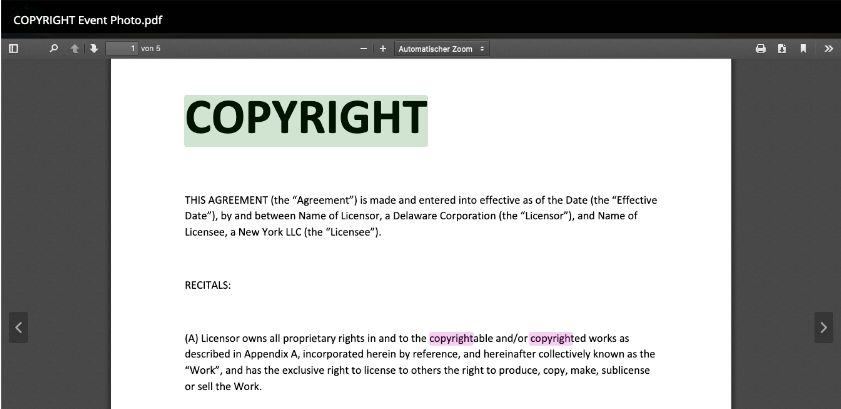
pdfPreviews
type: boolean, required: no, default: true
Whether to enable inline PDF previews for documents. Note that this relies on the built-in PDF-viewer of the browser. Requires back-end v2.9 or later.
When using full text search, the words you searched for will be highlighted (currently only works in Firefox, see Chromium Issue #792647)
nativePlayer
type: boolean, required: no, default: true, since: 2.9
Whether to use the native browser player to play videos (otherwise CELUM's is used)
highres
type: boolean, required: no, default: true for screens larger than 1024x1024px, false otherwise
Whether to use the high resolution preview format (up to 3000x3000px instead of up to 1024x1024px)
slideshowMillis
type: long, required: no, default: 5000, since: 2.9
How long to pause between each asset then in slideshow-mode (see toolbar)
preview3D
type: array of String, required: no, default: -, since: 2.9
For which file extensions to use the <model-viewer>-component, known to work are ['glb', 'gltf']
Note: This implicitly allows original file access (through the matching anura.global.preview3dExtensionWhitelist backend setting), and it will load an external component from unpkg.com/@google, which is why it's disabled by default
share_transform
type: function, required: no, default: -
Allows you to monkey with the share URL, e.g.
share_transform: function (url, asset) {
    return window.location.protocol +'//'+ window.location.host + window.location.pathname + '#asset=' + asset;
}
Events
- anura-loaded (options) - triggered when the plugin has loaded
- anura-lightbox-show (options) - triggered when the lightbox opens
- anura-lightbox-hide (options) - triggered when the lightbox closes
- anura-lightbox-sidebar-toggled (options, isVisible) - triggered when the sidebar is toggled
- anura-lightbox-toolbar-toggled (options, isVisible) - triggered when the toolbar is toggled
- anura-lightbox-show-asset (options, assetId, url, title) - triggered when an asset is shown (through open/next/prev)
Example
Since this is a plugin-inside-a-plugin kinda situation, here's a labeled example:
$('#anura-gallery').anuraGallery({ // <-- anuraGallery settings (or other main view)
    server: server,
    locale: lang,
    /* snip ,*/
    detail_view: 'anura',
    detail_settings: { // <-- anuraLightbox settings
        toolbar: {
            available: true, visible: true,
            layout: ['title', 'counter', /* snip ,*/ 'close']
        },
        sidebar: {
            available: true, visible: true,
            settings: { // <-- anuraDetails settings
                show: ['metadata', 'downloads'],
                metadata: [/* snip */],
            }
        },
        theme: 'light'
    }
});
Standalone
You can use anuraLightbox without any other anura component if that is useful to you. But it does expect certain attributes to be present in your link, namely href, rel, title, and if possible also the data-asset-id:
<a rel="lightbox-anura" title="Ponies standing on a hillock" href="https://some.celum/anura/first/asset.do?preview=1337&img=a.jpg" data-asset-id="1337">this is a lightbox link</a>$('body').anuraLightbox({
server: 'https://some.celum/anura/first',
locale: 'en',
trigger: 'a[rel^=lightbox-anura]',
}))... note that rel and trigger must match should you customize them.
Cropper
anuraCropper offers image cropping functionalities, while respecting existing download format configurations. This means that it tries to be intelligent about it, i.e. if the download format has an image size pre-configured, the cropper applies the aspect ration automatically and prevents selections smaller than that. Based on cropperjs, since: 2.9
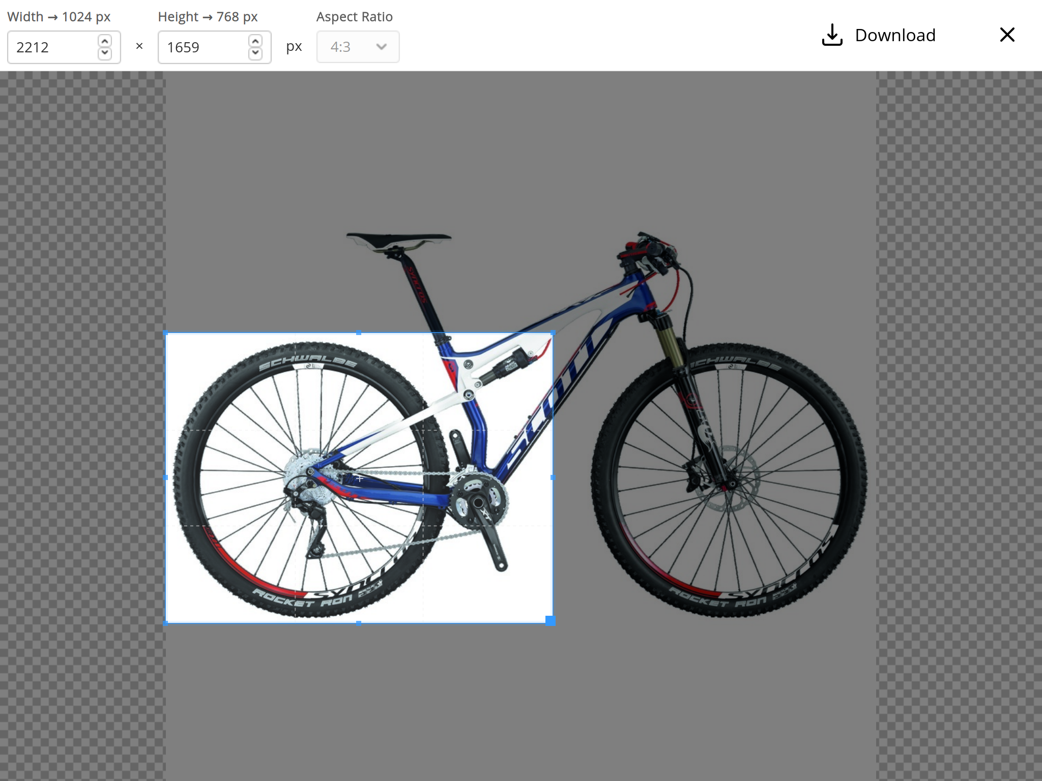
Supported out-of-the-box by:
- anuraBasket
- anuraDetails
Options
server
type: URL, required: yes, default: -
The endpoint to use, e.g. http://your.celum.server/anura/first
locale
type: String, required: no, default: CELUM's default language
The locale (ISO 639-1) to use, i.e. en. The availability of these depend on your CELUM configuration, usually en, de or fr. When left empty, CELUM's default language will be used.
assetId
type: long, required: yes, default: -
The ID of the asset you want to crop.
downloadFormat
type: long, required: yes, default: -
The ID of the download format you ant to use for cropping. Needs to be one where cropping is enabled (editable-flag in Anura, in CMA the setting is Download Format Interceptors: imageEditorDownloadFormatInterceptor).
mode
type: enum (
downloadorapply), required: no, default:download
Which mode the cropper runs in. download offers a button to directly download the resulting file, while apply only relays the cropping information to the callback function (see below), e.g. for use in the basket.
callback
type: function, required: when
mode: 'apply', default: console.log
A callback to relay the cropping information to.
callback: function(options, geometry, parameter) {
    // ... do something
}
Parameters:
- options: the options that anuraCropper was opened with
- geometry: an object containing
widthandheight, as well as the offset (top-left) asxandy - parameter: pre-assembled
cropvalue you can use in the download call
aspectRatios
type: array of String, required: no, default:
['-','1:1','1.91:1','3:2','4:3','16:9','16:10']
When present, offer a dropdown with aspect ratios the user can choose from (delimiter is :, free choice is -).
If the downloadFormat has a pre-defined
widthandheight, the dropdown will be locked to fit that aspect ration.
presetSizes
type: array of String, required: no, default: -
When present, offer a dropdown with sizes the user can choose from (delimiter is x, free choice is -).
E.g. ['-','728x90','336x280','300x250','300x600','320x100']
If the downloadFormat has a pre-defined
widthorheight, the dropdown is hidden.
cropperjs
type: object, required: no, default:
{viewMode: 2, rotatable: false, responsive: true, autoCropArea: 1, scalable: false}
cropperjs defaults you can override. A viewMode < 1 is not suported, as download formats can't crop outside the image into empty space.
Util
anuraUtil exposes a variety of utility functions used by every plugin. You can also use them for customizings. The prefix parameter is used for multi-instance, you can simply pass en empty string if you don't need that.
-
hasState(prefix, key) - check if a state parameter (
#some-state=foo) is present -
getState(prefix, key) - get a particular state
-
getStates() - get all state parameters
-
setState(prefix, key value) - set a particular state
-
setStates(states) - set an array of states
-
removeState(prefix, key) - removes a particular state
-
removeStates(prefix, fragment) - remove all states like
fragment -
tokenProvider() - provider of tokens, used for authentication
-
onRequestFailure() - global request failure handler
-
icons{} - defines the icons to be used as a map of SVGs. Known icons: left, right, download, share, basket, sidebar, close, fullscreen, check, sun, play, crop, ok, plus, down, mail
# e.g. override the existing basket icon
$.anuraUtil.icons.basket = '<svg ...>...</svg>'
Translations
All strings used by the front-end are retrieved from CELUM's message bundle. You can override any of these be prepending anura. to the key, so the changes only affect Anura, but not CELUM's UI. E.g. anura.paging.page=P.. The keys that already start with anura are provided by the back-end.
| key | value (EN) |
|---|---|
| actionmenu.sidebar.enable | Show Sidebar |
| anura.addToBasket | Add to basket |
| anura.download.mailinput.mail | E-Mail Address |
| anura.download.mailinput.text | Please enter your contact information, so we can inform you about changes to the assets (such as copyright expiration). |
| anura.loadMore | load more |
| anura.relations | Relations |
| anura.removeFromBasket | Remove from basket |
| anura.similarAssets | Similar Assets |
| anura.slideshow | Slideshow |
| anura.versions.date | Version date |
| anura.versions.nr | Version number |
| assetlist.header.image | Preview |
| assetlist.header.mediaType | Asset Type |
| assetlist.header.name | Name |
| assetlist.header.originalFileName | File Name |
| assetlist.viewsettings | View |
| AssetProperties.fileExtension | File extension |
| assetReview.view.asset.headerNewReview | Add New Review |
| assetReview.view.asset.headerReviewList | Review List |
| assetReview.view.asset.label.checkReviewError | Enter a rating and/or a comment. |
| assetReview.view.asset.label.comment | Comment |
| assetReview.view.asset.label.rating | Rating |
| assetReview.view.asset.label.ratingAverage | Average Rating |
| assetReview.view.asset.title | Reviews |
| common.actions.clear | Clear |
| common.actions.save | Save |
| common.copyToClipboard | Copy link to clipboard |
| common.form.inactive | Not available |
| common.object.creationDate | Created |
| common.object.lastModifiedDate | Modified |
| common.object.originalFileSize | File size |
| common.object.technicaltype | File type |
| detailview.generalinfo.title | General Information |
| detailview.keywords.title | Keywords |
| detailview.technicaltype.size | Size |
| DocDocumentProperties.pages | Pages |
| downloadformatgroup.all.downloadFormat | All Download Formats |
| downloadFormatInterceptor.messageBox.message | The author intended not to use any copyrighted material ... |
| downloadFormatInterceptor.messageBox.title | Disclaimer |
| downloadformatmanagement.downloadformat.name | Download Format |
| externallinks.error.nopermission.asset | You have no permission for asset with id: {0}! |
| fileproperties.* | (dynamic, see local fileProperties-fields.xml, name=...) |
| general.close | Close |
| general.download | Download |
| general.infofields | Information Fields |
| general.links | Links |
| general.next | Next |
| general.previous | Previous |
| general.units.px | Pixel |
| interceptor.disclaimerconfirmation | Accept |
| loading.general | Loading... |
| MediaAssetProperties.filesize | File size |
| MENUITEMID_DOWNLOAD | Download |
| MENUITEMID_MAILTO | Send Hyperlink |
| MENUITEMID_METADATA | Metadata |
| MENUITEMID_SEND | Send |
| MENUITEMID_SHARE | Share |
| MENUITEMID_SHOW_FULLSCREEN_PREVIEW | Fullscreen Preview |
| paging.page | Page |
| PdfDocumentProperties.modifiedDate | Modified date |
| PdfDocumentProperties.pages | Pages |
| pinaccess.name.fallback | PIN-Link |
| search.cleanUp | Clear |
| search.documentProperties | Properties |
| search.ignoreSelected | No restriction |
| search.notSelected | Not selected |
| search.modified | Modified |
| search.searchItem | Search term |
| search.searchOtherObjects | Unknown |
| search.selectAll | Select all |
| search.selected | Selected |
| search.startSearch | Search |
| search.uploaded | Uploaded |
| share.newPin | New PIN-Link |
| TgaImageProperties.creationDate | Creation Date |
© brix Solutions AG