anura-details
Shows detailed information about an asset (metadata)
While it's made to live inside of anura-lightbox, you could also put it somewhere else as a standalone component.
Attributes
adapter
required: depends, live: yes, default: -
This is set automatically when used inside an anura-lightbox. Otherwise you need to point it to an adapter.
<anura-details adapter="#my-adapter"></anura-details>
asset
required: yes, live: yes, default: -
Asset ID of which to display metadata of. This is set automatically when used inside an anura-lightbox that has a sidebar. Changing this will cause the component to reload.
<anura-details asset="123"></anura-details>
allowlist
required: no, live: on-load, default: -
Only show metadata listed in this (comma-separated) list. The nature of the keys is specific to the implementation of the adapter. For convenience the key is shown in the data-id attribute of each entry. E.g. name,info_108,info_42
<anura-details allowlist="name,info_123,info_456,info_789"></anura-details>
denylist
required: no, live: on-load, default: -
Don't show metadata listed in this (comma-separated) list. Ignored when an allowlist is defined. The nature of the keys is specific to the implementation of the adapter. For convenience the key is shown in the data-id attribute of each entry. E.g. info_113,file_size.
<anura-details denylist="info_666"></anura-details>
merge-sections
required: no, live: on-load, default: false
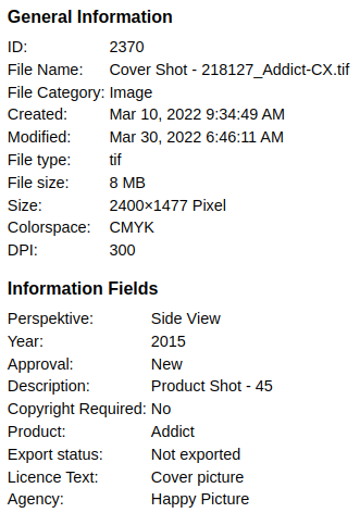
Adapters can provide an arbitrary number of metadata sections (e.g. "General Info" and "Information Fields"). Set merge-sections to true in order to show all of them in a single section (called "Metadata", translation-key: metadata).
<anura-details merge-sections="true"></anura-details>
line-clamp
required: no, live: on-load, default: 300
Long text fields get clamped by default, use this to set after how many characters this should trigger, or set it to 0 to disable.
<anura-details line-clamp="500"></anura-details>
nl2br
required: no, live: on-load, default: off
Some DAMs send a mix of <br> and \n as line breaks. Turn this on to try and normalize them to <br>.
<anura-details nl2br></anura-details>
folded
required: no, live: on-load, default: -
A comma-separated list of detail sections that should be folded by default. You can get the ID of the section from its data-id attribute. E.g. technical_information,meta_data.
Note that sections that have been folded manually by the user will also be persisted in this property, but only in the current session.
<anura-details folded="technical_information"></anura-details>
relations
required: no, live: on-load, default: -
When set, a second tab will appear that contains related assets of requested relation types (if your DAM supports that)
- CELUM: use either the id (found in asset-relations.xml, e.g.
languageVariant) or the numeric ID (query or network-log asset.do?relations=-1, e.g.9)- you may also use an artificial construct
noderef_{infofield-id}to pretend that assets with the same value in the giveninfofield-idare related, e.g.noderef_123for field 123.
- you may also use an artificial construct
- Sharedien: use the identifier (Settings, Configuration, Relation Types, first column), e.g.
Translation - others: doesn't exist as a concept (at the time of writing)
<anura-details relation="first-relation-id,second-relation-id"></anura-details>
with-parents
required: no, live: on-load, default: -
When set, the detail page will load the assets parent node/folder/categories and display them as metadata. When you have an anura-tree, it will render them as buttons to navigate to them.
<anura-details withp-parents="optional-root-node-id"></anura-details>
Slots
- header - content that should appear before the metadata
- footer - content that should appear after the metadata
Parts
<div part="details-container">
  <h4 part="details-title">
    <anura-icon part="details-title-icon"></anura-icon>
  </h4>
  <dl part="details-dl">
    <dt part="details-dt"></dt>
    <dd part="details-dd">
      <a part="details-link"></a>
    </dd>
    <!-- snip, repeating dt & dd-->
  </dl>
  <!-- snip, repeating h4 & dt-->
</div>
© brix Solutions AG