Admin Guide
Philosophy
Create once, use everywhere. This credo is the basis for most objects and their relations. For example, the client has a logo, so there's exactly one logo element, which then gets used on all templates that should have a logo. When you have to update the logo, you only do that once, and it's updated everywhere. The same goes for fonts, colors, text styles, relations and so on.
Furthermore, the system is inherently multi-lingual and multi-color-spaced, i.e. a slogan will be different depending on the language, but it is still just one element. Or the CMYK logo is usually a different vector file than the RGB one, but it is also just one element.
A note on languages: The system differentiates between user interface languages and content languages. In other words, you can order a German flyer while your user interface is set to English. Hence you may be asked to enter a title in a language that can't be ordered in a template, or vice versa.
Users
Users work pretty much as you might expect them to - each user has a login (either directly or through SSO) and some properties, such as their address (for shipping etc.). A user belongs to exactly one group and has a specific role - both of which is relevant for the permissions that the user gets.
Roles
A users role is an abstraction for a set of functional permissions, e.g. if a user is allowed to release orders. These functional permissions apply system-wide, but their scope may be restricted through group permissions (see groups). You can either choose one of the default roles, create a specific role for that user (Custom ACL) or create your own role (Users -> Roles). The following functional permissions are available:
- Create orders
- Approve orders
- Edit other users' orders
- Layout orders
- Print orders
- Edit users
- Switch users
- Edit editable elements
- Edit templates
- Edit divisions
- Edit labels
- View statistics
- Edit visible elements
- Edit user groups
- Translate orders
Groups
User groups are a mechanism to assign permissions to a set of users. In contrast to the role, these permissions always have a context, e.g. group A can see templates B, or user C can release templates D.
Note that group permissions are a deny-list (aka blacklist), so when you add new ones, check their permissions.
Permissions can be assigned for
- Visibility of templates (through template groups)
- Controllers (people that can release orders)
- Graphic artists (people that create special formats manually)
- Print Operators (people that can print and ship orders)
Depending on the context, these permissions can be assigned either via template groups or via user groups. When using both at once, an intersection (matching template group AND user group) is attempted. Failing that, a union will be used (matching template group OR user group). If there are still no matching users, the master controller will be informed.
Templates
A template is simply an aggregation of elements that get placed at certain coordinates on a canvas. By itself it doesn't do much, except define the properties of the canvas and how a user can order it (such as output format, delivery and controlling).
Templates do however control the dimension(s), the ordering and release processes and other aspects of the rendering process.
Options
General
- Title: The title of the template (in all UI languages)
- Status: Lets you disable a template, so it can't be seen or ordered anymore. For admins and layouters the status under construction can be used to build and test a template without showing it to the users yet.
- Template languages: In which languages the template is available. Requires the content of your elements to also be available in these languages.
- Number of pages: How many pages your template has. Note that when using flow-layout this only defines your template pages, not the actual number of pages of any given order.
- Preview Image(s): Thumbnails to show the user what to expect. Page previews are useful when layouting. Note: use pictures that are at least 800px wide if you can.
- Template group: In which template group this template resides. This is an alternative input for the template grouping feature that is also available at
/admin/templategroups.
Layout
- Dimension: The (default) dimension of your template. This is what you will be layouting in. They can still change for individual orders when using the ad-sizer module. The last dropdown conveniently provides quick defaults for standard dimensions, such as A4 etc. Be careful with the "adapt layout"-option, this will resize all element assignment coordinates proportionally.
- Renderer: How the template should be rendered.
- PDF - the default renderer, uses PDFlib to generate a pdf
- Image - also uses PDFlib, but then converts the result to an image (jpg/png/tif)
- Video - derivate of the image processor, creates a slideshow from the pages (mp4)
- None - does nothing (if you just need an order form, for use with the "manual special format")
- Color space: In which color spaces the template is available. Requires the content of your elements to also be available in these color spaces (if not, an automatic color conversion is attempted, but your mileage may vary).
- Format: Which alternative format options are available. These include:
- Standard: No format adaption is possible, simply use the dimensions from above
- Manual special format: The order form is the same as always, but instead of rendering it automatically, it is sent to a human (role: graphic artist) to be created manually. This is used for weird formats or artistic image placements that can't be handled by a machine.
- Automatic special format: The ad-sizer module - allows you to set minima and maxima for your width and height. The elements on the page will be rearranged according to the ad-sizer rules on each element (e.g. the logo remains the same size in the upper right, but the background image scales linearly)
- Standard sizes: Basically the same as "automatic special format", but restricted down to a list of pre-configured dimensions (these can be administered under
/admin/templatesizes)
- Flow strategy: When using the flow module, defines how the pages of your template are repeated when rendering an order that has text overflows.
- Singletons: By default a user is only asked to fill out a particular field once. In case you want to use the same element multiple times but with different values, check this option.
- Skip: Skip certain pages when rendering a print PDF. Useful when you use pre-printed sheets, e.g. for the backside of a business card. This way the page is visible in the preview file, but not in the print PDF.
Ordering
- Approval process: If and how an order is released. When required, an order can be sent in for review by either one or two different controllers. When using controllers, you can restrict the controller audience further per template by specifying which group is responsible for releasing an order. This can be used as a two-stage process where the order is first reviewed "locally" by the authors division, and is then reviewed a second time by the branding department, for example. The pre-control option only applies to manual special formats, which can optionally be reviewed even before they get sent to the graphics department, saving them the work for something that would have gotten rejected later on anyway.
- Workflow: Custom workflows if you need something special, needs to be implemented in code.
- Quality profiles: Choice of 300dpi or 150dpi for the final output.
- Delivery options: How the order is delivered to the author. Download will make the PDF available to the author immediately after ordering it (provided it's not a manual order), while Mail order will send the PDF to a print operator for printing and sending the physical result back to the author. The latter case will also enable you to set certain delivery options, such as number of copies or a due date. Which of the print operators will be asked to print the order depends on their permission, e.g. you may have one per country, or a special one that only does business cards.
- Order information: Additional information that the author needs to provide when submitting the order, such as a cost center. These fields can be created freely in
/admin/customfieldsand can be assigned on a pre-template basis. You can also re-order the fields through drag & drop. - Attachment: An additional file that is sent along with every download, e.g. instructions for use.
Post-Rendering
Controls technical aspects of the rendering phase, such as ICC profiles, cut marks and imposing (e.g. re-rendering business cards on a bigger sheet for efficient printing)
Instructions
You can optionally add instructional messages for each step along an order's life, both for the author when they're editing or ordering, as well as for each step in the workflow (controlling, graphics, printing).
Layouting
Layouting is where the rubber meets the road. This is where all of the previous work setting up elements and styles comes to fruition - even though we're simply drawing rectangles at this point.
Example: for a business card, all the different inputs can be condensed down to just two rectangles. A text group does the heavy lifting assembling all the text inputs and their style. And of course there's the logo.
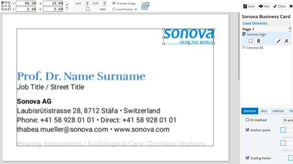
This is where a previously uploaded preview image comes in handy, so you can see what you're aiming for.
In order to assign an element to the template, drag it from the available to the used elements. Note that their position in the list are relevant for both the order in which the elements get drawn, as well as the order in which their inputs are presented to the user. To define its coordinates, enable visibility (as not all elements need to have a coordinates) and adjust them as needed, either by dragging or by entering the coordinates manually at the top (keyboard shortcuts are available, check the help button in the toolbar). At this point you can also override styles in the lower left corner. By default, the parent style of the element is used, but you can override every setting by unchecking the inheritance checkbox. This is where you'd set your font sizes etc. Note that assignment-private text styles can be generated through the plus-button next to the style dropdowns.
In order to test a layout, first click the save button and then the test button right next to it. This will open a new tab with the same editing experience that a regular end-user would have. Having an open test tab also enables you to use the live-preview mode, which gets updated automatically each time you save.
Linked templates
Linked templates exist so that you can have different ordering behavior while borrowing the actual layout from another template. So all the same options are available as in a regular template, except you can't change the layout.
Elements
An element is an isolatable component of your layout. It could be a logo, an address block or a heading. All of these get broken out into their own element, so they can be reused and reassembled later on. An element has a few fundamental properties:
- Input Type: What the user sees, e.g. a text field or a dropdown.
- Output Type: What gets rendered onto the PDF, e.g. text or an image.
- Style: Defines the basic behavior of the element, e.g. its fit method or text style.
- Content: Pre-defined content, depends on the type, e.g. ready-made texts or default images.
Input Types
- Single-Line: Just a simple, one line text input.
- Multi-Line: A textarea, optionally with a Rich Text Editor for inline styling (bold, italics, lists etc.)
- Text Group: A text element consisting of multiple other text elements, used for composing a number of different inputs into one block of text, e.g. an address. The group itself is invisible when ordering, but the group members will be shown (in that order). See below for more details.
- Fixed Value: An element that can not be changed by the user, e.g. a logo.
- Checkbox: A checkbox input that is only useful when used in conjunction with relations, e.g. to toggle other inputs on or off.
- Dropdown: A list of pre-defined values a user can choose from. These values each have a title and can contain text, images or PDFs. Setting this to user-editable will enable file uploads by the user, depending on the type.
- Dropdown + ...Line: A list of pre-defined values, but with an additional single- or multi-line input below that can be edited by the user (depending on whether the specific value allows editing). Useful for providing the user with some sort of text template that he can then further refine.
- QR-Code: Works a bit like a text group, except that the fields are standardized and the output is a QR-Code.
- Overflow: When using flow layout, consumes the text overflow of another element and displays the remaining text.
Text Groups
A special kind of element that allows you to combine multiple elements into a single block of text. For example, an address block consists of multiple input fields (name, street, ZIP/city, phone, mobile etc.), but should be rendered into one block of text like:
Name
Street
ZIP City
T: Phone, M: Mobile
But it is more than just an aggregator, it can also assemble the texts in a sensible manner. In our example, the user might not want to publish their mobile phone number and leaves the input field empty. The text group detects this and also removes the , M: that came before the mobile, as it is no longer needed and hence renders to:
Name
Street
ZIP City
T: Phone
In the UI, this is represented with lines - when the center element disappears or is empty, the entire line is not rendered:
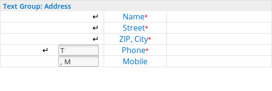
Additionally, each element can have its own text style (if the style is allowed as an inline style of that element). Lastly, each element can also be displayed or hidden depending on if the last line was visible (useful for commas vs. line breaks depending on the input that was provided)
Output Types
The output types define how an element is rendered on a canvas and which styling options are available.
- Single Line: deprecated, use Multi Line even for single lines, has way more features
- Multi Line: Text output that can be styled in a multitude of ways
- Image: Raster graphics, use only when you don't have a vector graphic or it's an actual photo
- PDF: Vector graphics, use whenever you have it, e.g. for logos etc.
Style
Available styling, mostly depending on the output type. Some general settings will always be available, while others, such as text style, will only apply to text elements.
- Each element has a default style that is defined on the element itself. It can however be overridden per element assignment, so you should only apply styles that apply regardless of where the element is placed, i.e. the fit method. Things like font size should probably be set (or overridden) depending on the element's placement.
- Text elements can have multiple text styles (defined separately), a default one plus what are called inline styles that change in-line (or in an RTE). Note that these must be enabled in the inline style tab first. Here you can also specify what style changes, such as bold, are allowed - otherwise they will be discarded. Note that this also applies to text groups, so if a style is allowed on an element of a text group, this does not mean that the text group is allowed to use that style, so enable it there as well if that's needed.
- Styling also defines how elements behave both in the ad-sizer and the flow-module.
Note that while it's possible to not define a style for your elements, the renderer might not like not knowing what font to use and will either use a fallback or refuse to render it at all.
Text Style
Text styles are defined separately and should also be held as generic as possible. So for example, you define how a headline generally looks, but the exact font size is probably better left to the individual element assignment. You can and perhaps should specify a default size anyway, but don't create multiple very similar styles.
Colors and Fonts are also handled separately and are available globally, so you only need to define just what shade of blue your company uses, and then you can re-use that everywhere (font color, border color, fill color, etc.). The same goes for fonts, with a small concession to how Rich Text Editors work, i.e. you must define what exactly "bold" and "italics" means in regards to the current font style.
Relations
Probably the most powerful feature of brix:papilio - it allows you to dynamically update the layout, update dropdowns or make entire sections of your layout disappear. Relations are only available on value lists, i.e. dropdowns and checkboxes (which is treated as a dropdown with two values, true and false).
Under Elements > Relations, the following relation types are available:
- Value relations - restrict the values of dropdown B depending on what was selected in dropdown A.
- Visibility relations - make entire elements disappear based on was selected in a dropdown.
- Style relations - change the style of other elements based on was selected in a dropdown.
- Template value relations - restrict certain values to only be available on certain templates.
To get an overview of the existing relations, use the diagram tab.
Relations only work top-down, e.g. only elements that appear before your target can have an influence on the values of your target, in order to prevent update-loops.
Value Relations
Another motivation to use relations is consistency. For example, some subtitles may not make sense depending on the title you chose. For example, the title "Merry Christmas" may be combined with the subtitle "and a happy new year", but not with "may the force be with you". To ensure this, you can simply create a value relation title->subtitle to restrict what's available in the second dropdown.
In the UI, this is represented in two columns, one to hook up the source element to the target element. The second column is then used to connect source values to certain target values.
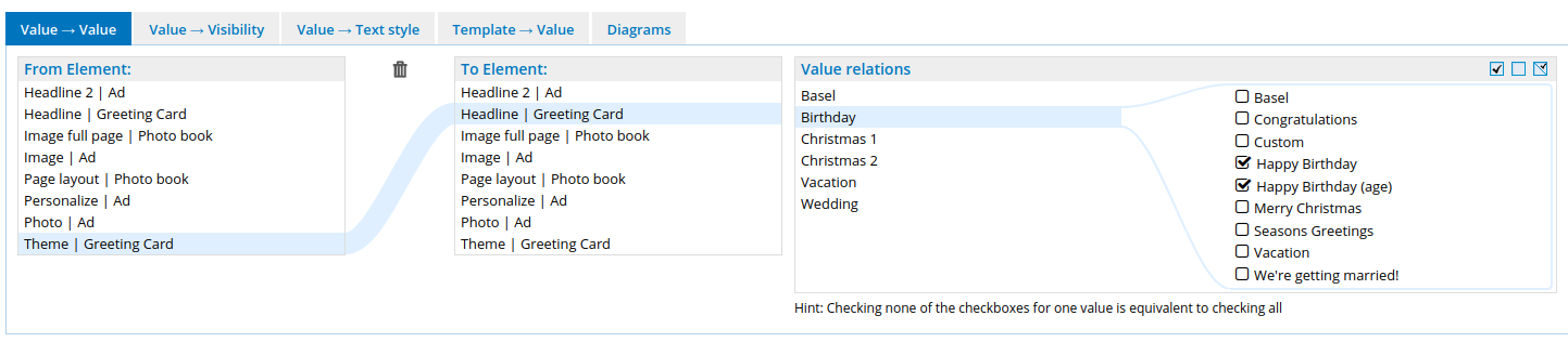
By default, no restrictions apply - but as soon as you start restricting certain values, all target values are expected to be mapped - otherwise they won't show up. This means that when you add new values to an element with relations later on, you should check the corresponding relations - otherwise the new value may or may not show up as you expect.
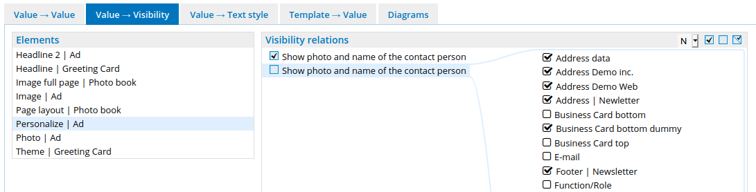
Visibility Relations
If you have several variants of a layout, you don't have to create a new template for each variant - you can just use relations. For example, your brochure may have one or two contacts on it, and the layout changes based on the space that is available as a consequence. Since a picture says more than a thousand words, here's an example:
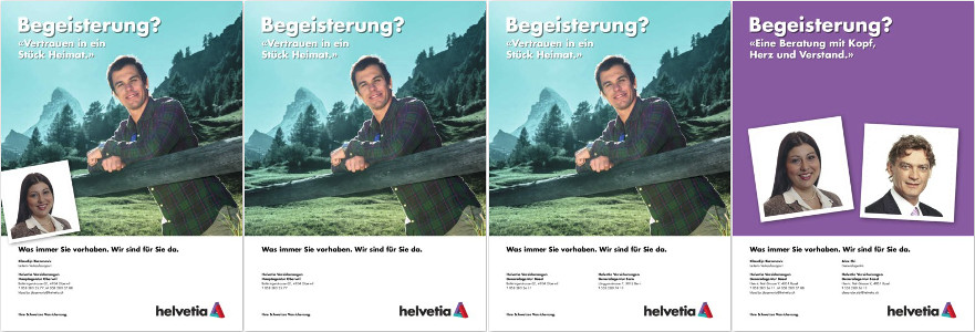 This is a single template, with the options "show portrait photo" and "second address" toggled on/off. Note how it doesn't just make elements disappear - in the last one it rearranges the layout to make space for the two photos.
The administration of these relations work in a similar manner to the value relation, only that the left column only contains source elements, as the target elements appear in the column on the right, as they are the target value in this case.
Style relations
Style relations can be used to change the look of other elements, based on a selected value. This is useful for light vs. dark backgrounds for example, where you may want to invert the color of the headline:
Template relations
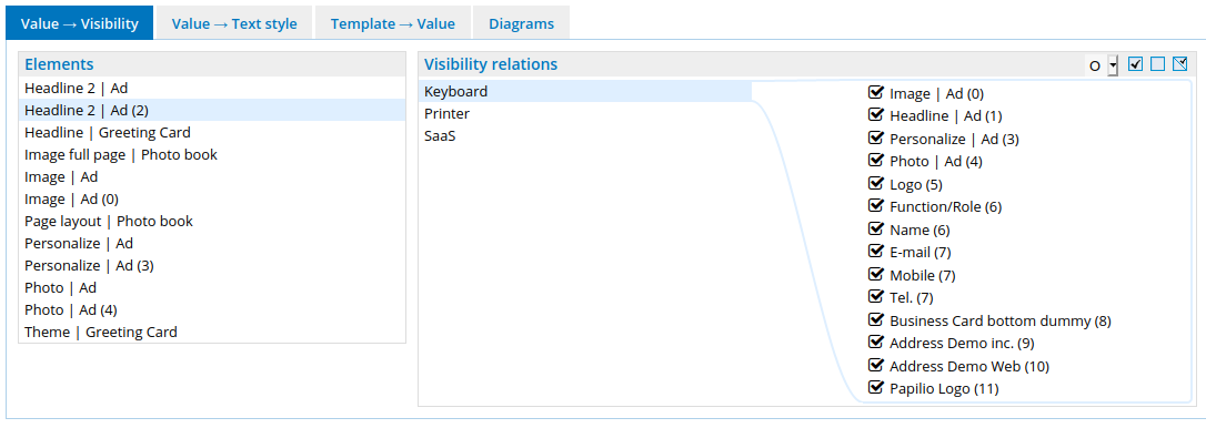
In addition to the global relations that work on the element regardless of where it is used, template relations only apply to a single template and are thus administered under Templates (<->-icon).
The available relations are limited to visibility- and style-relation, but you can change the visibility or the style on every element assignment (placement of an element on a template), as you may show/hide the same element in different places, depending on what was selected before (the portrait photos in the screenshot above are a good example).
In order to indicate which element assignment is which, the order in which they appear in is appended at the end like element (1). Elements that belong to a text group will be in textgroup-order but will carry the same number (the one of the text group).
Integrations
There are three types of integrations:
- cron jobs - tasks that run at a regularly scheduled interval
- UI extensions - custom UI pages, usually accessible via the toolbar on the dashboard
- Workflows - change the behaviour of any step of the order process ... but all of them are heavily dependant on the customer, so there are no "standard" integrations.
Examples
Just to draw inspiration from, not as a conslusive list:
Address Syncs
You may want to offer the user a selection of addresses of your business:
We have several flavors of these, e.g.
- A cron job that connects to an SFTP server weekly and downloads a CSV file with the addresses. Values are retrieved via the "external source" type.
- A UI extension that users can upload a well-defined Excel file to, and get an overview of the detected changes. Values are materialized directly onto existing elements (old school).
- A UI extension that users can upload a well-defined Excel file to, but it gets stored in the database, for easy retrieval via the "external source" type (the cleanest way).
User data sync
If you can, set up SSO and read the user's attributes when he loggs in. You may also store custom attributes that are not part of our user model. If that is not enough, we have:
- A custom SSO mapping that retrieves additional data from a HR system (based on the username). These get stored in the session and are then available for a custom workflow.
- Custom SSO mappings that transforms data recieved fromn SSO attributes. These are mainly used for custom group assignments (e.g. only people from the HQ get to use some templates).
Workflows
For every state change of an order, you can inject custom behavior (change the order state, reroute the user, etc.). Some examples:
- When an order is ready for printing, don't notify the print operator, but queue them up for a monthly delivery instead.
- When an anonymous user has submitted his order, log him out and send him back to where he came from (e.g. the intranet)
- On a business card, the user can choose to customize his job title. Doing so will cause a secondary review by HR.
- Instead of rendering the order as a PDF, convert the pages to a slide show and derliver them as a video instead.
Cron jobs
- Upload recently completed orders into a DAM.
- Create a monthly digest about the usage of certain slogans used in various templates.
- Import users from a third-party system (useful if you don't have SSO).
© brix Solutions AG