anura-filters
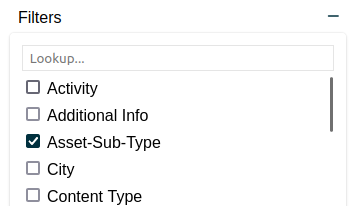
<anura-filters adapter="some-adapter" scope="aside > *" insert-before="anura-reset"></anura-reset>A dropdown-like component that offers additional filters, based on the available metadata (i.e. <anura-select>, <anura-text> or <anura-date>, depending on the type).
Attributes
adapter
required: yes, live: no, default: -
With which adapter to talk to (to load the metadata from)
<anura-filters adapter="#my-adapter"></anura-filters>
scope
required: probably, live: on-load, default: document
Where your other (existing) filters live, so their checkbox is already checked initially.
<anura-filters scope="#my-sidebar"></anura-filters>
insert-before
required: no, live: yes, default: -
Where new filters should be inserted, before the configured component (e.g. anura-reset).
<anura-filters insert-before="anura-reset"></anura-filters>
insert-after
required: no, live: yes, default: itself
Where new filters should be inserted, after the configured component (e.g. anura-counter). Default is the component itself.
<anura-filters insert-after="anura-searchbar"></anura-filters>
update-search
required: no, live: on-change, default: 'anura-gallery,anura-table,anura-map'
When adding new filters, view-components should probably know - this defines what queries to use. Note that this simply bumps their existing search= attribute, so it in turn should use a query that is generic enough to "catch" the new filter as well, e.g. #sidebar > *. This will also trigger an update on the view, in order to update the facets, unless the adapter specified facets="false".
<anura-filters update-search="#my-gallery"></anura-filters>
allowlist
required: no, live: on-load, default: -
Only show metadata fields listed in this (comma-separated) list. The nature of the keys is specific to the implementation of the adapter. Check the value of the checkbox in the UI.
<anura-filters allowlist="123,456"></anura-filters>
denylist
required: no, live: on-load, default: -
Don't show metadata fields listed in this (comma-separated) list. Ignored when an allowlist is defined. The nature of the keys is specific to the implementation of the adapter. Check the value of the checkbox in the UI.
<anura-filters denylist="789"></anura-filters>
Parts
<header part="header">
    <span part="header-title"></span>
    <button part="header-toggle select-button ">
        <anura-icon part="header-icon header-icon-toggle"></anura-icon>
    </button>
</header>
<fieldset part="fieldset">
    <input part="fieldset-search">
    <div part="fieldset-body">
        <div part="select-container">
          <label part="select-label">
              <input part="select-input">
              <span part="select-name"></span>
          </label>
        </div>
    </div>
</fieldset>
© brix Solutions AG