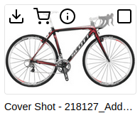
anura-asset
<anura-asset asset-id="42" title="my-asset.jpg" thumbnail="https://..." preview="https://..."></anura-asset>This is a passive component that is helpless without a surrounding component, such as <anura-gallery>

Attributes
title
required: no, live: on-load, default: asset.name
Overrides the title of the asset - string interpolation is supported, e.g. asset.metadata[title].value.
<anura-asset title="${asset.metadata[title].value}"></anura-asset>
alt
required: no, live: on-load, default: asset.name
Overrides the alt attribute of the figure - string interpolation is supported, e.g. asset.metadata[description].value.
<anura-asset alt="${asset.metadata[description].value}"></anura-asset>
thumbnail
required: yes, live: yes, default: handed down by parent component
The URL that represents a thumbnail picture of this asset (usually around ~256x256px). This is usually handled by the component that is injecting the <anura-asset> and thus needs no intervention.
preview
required: yes, live: yes, default: handed down by parent component
The URL that represents a preview picture of this asset (usually around ~1024x1024px). This is usually handled by the component that is injecting the <anura-asset> and thus needs no intervention.
preview-mime
required: no, live: yes, default: handed down by parent component
The mime type of the preview, launches a video player or PDF preview instead of a plain image when applicable. This is usually handled by the component that is injecting the <anura-asset> and thus needs no intervention.
buttons
required: no, live: yes, default:
sidebar, close
Which buttons to show in the actions section, and in which order. Known buttons:
info- button to request more details about the asset (usually opens a lightbox)download- download the assetbasket- put the asset in the download basketcheckbox- checkbox to mark this asset for later use. This will always align itself at the very end (CSS).
<anura-asset buttons="download,basket,checkbox"></anura-asset>
you can set
buttons=""to remove all buttons and hide the action bar completely
actions
required: no, live: no, default: hover
How the action menu should behave. Default is hover, which reveals the actions when hovering over the asset. Can be set to bottom to suppress the hovering effects.
<anura-asset actions="bottom"></anura-asset>
quick-download
required: no, live: yes, default: -
Which download format to use for the download button.
<anura-asset quick-download="original"></anura-asset>
overlay-icon
required: no, live: yes, default: -
Adds an <anura-icon> over the thumbnail, e.g. to communicate that this asset can't be downloaded.
<anura-asset overlay-icon="slash"></anura-asset>
Events
asset-added
{asset: asset, adapter: adapter}
Triggered by the parent component when the asset has been added to it. Note that <anura-asset> itself relies on this event to bootstrap itself (thumbnails etc.).
asset-details
{asset: asset}
Request for detailed information display for this asset - issued both when clicking on the preview or the info button.
This will cause anura-gallery to tell anura-lightbox to open said asset for a full-screen view.
asset-select
{asset: asset, selected: boolean}
When using the checkbox button, indicates that said button has been clicked, and whether it is currently in a selected state.
This will cause anura-gallery to update its value attribute.
Variables
--asset-width and --asset-height
required: no, default: 12rem
The width and height of the component, usually used from the outside like
anura-gallery::part(anura-asset) {
    --asset-width: 15rem;
    --asset-height: 15rem;
}
--thumbnail-border-raduis
required: no, default: 0.25em
The border radius applied to each thumbnail.
--thumbnail-background-color
required: no, default: -
The background color applied to each thumbnail.
Slots
buttons
required: no, default: -
Add you own buttons to the action menu. Buttons found within are given the assets's ID as a value for convenience, e.g.:
<anura-asset>
    <span slot="buttons">
        <button onclick="alert('Asset '+this.value)" title="Demo">
            <anura-icon icon="alert-triangle"></anura-icon>
        </button>
    </span>
</anura-asset>
default slot
required: no, default: -
The default slot (i.e. an unnamed slot) is present inside the asset-content section. Upon insertion, this slot is scanned for ${} inside of text nodes, so you could for example easily add a description to the asset as follows:
<anura-asset>
    I'm asset ${asset.id}!
</anura-asset>
which at runtime would yield:
<anura-asset attributes="omitted">
    <figure>...</figure>
    <div part="asset-content">
      I'm asset 1337!
    </div>
</anura-asset>
This also works inside subnodes, and on any title attribute inside.
Parts
<anura-asset part="anura-asset">
    <figure part="asset-figure">
        <img part="asset-thumbnail">
        <figcaption part="asset-title"></figcaption>
    </figure>
    <div part="asset-content">
        <slot></slot>
    </div>
    <div part="asset-actions">
        <button part="asset-button"><anura-icon part="action-icon"></anura-icon></button>
        <!-- snip, repeats button -->
    </div>
</anura-asset>
E.g. colorize the asset name (inside an anura-gallery):
anura-gallery::part(asset-title) { color: green; }© brix Solutions AG