anura-select
<anura-select adapter="some-adapter" source="123"></anura-select>A multi-select component with filtering capabilities
Attributes
adapter
required: yes, live: no, default: -
With which adapter to talk to (to load the values from)
<anura-select adapter="#my-adapter"></anura-select>
source
required: yes, live: on-load, default: -
What metadata field to query in order to get the possible values from. The value type will depend on the adapter that you're using (usually an ID or a UUID)
<anura-select source="123"></anura-select>
filter
required: no, live: yes, default:
trueorvisiblefor lists with 20+ items
How to handle the search field, possible values:
true- search field is available, but must be toggled through the search-icon (default)false- the search field is not availablevisible- the search field is visible without having to toggle itasync- impliesvisible, but fetches the matching values from the DAM (if the DAM supports it). This is useful for large lists.
<anura-select filter="visible"></anura-select>
radio
required: no, live: on-load, default: false
Whether to use radio buttons (i.e. only allow a single selection) instead of checkboxes
<anura-select radio="true"></anura-select>
value
required: no, live: set by component, default: -
The value deriving from the inputs (comma-separated). Can be used to set an initial value, but will only be written to by the component afterwards.
<anura-select value="103"></anura-select>
type
required: no, live: set by component, default: -
The type of field that should be affected. This will be set by your adapter and is specific to the implementation. Don't touch this.
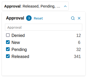
hide-title
required: no, live: on-change, default: false
Whether the title that is displayed inside the select box should still be visible when values are selected. Given the screenshot above:
false: "Approval: Released, Pending, New"true: "Released, Pending, New"
<anura-select hide-title="true"></anura-select>
sort
required: no, live: on-load, default:
name-asc
How the options should be sorted, e.g. name-desc or id-asc (-asc is optional/default).
Available keys are name, id, value and order, but it depends on your DAM if they are present or make sense.
<anura-select sort="name-desc"></anura-select>
root-node
required: no, live: on-change, default: -
CELUM only, use a different root node for node-referencing fields (needs to reside beneath the actual root node).
<anura-select root-node="123"></anura-select>
depth
required: no, live: on-change, default: 3
CELUM only, when loading a tree, how many child-levels should be fetched
<anura-select depth="3"></anura-select>
skip-levels
required: no, live: on-change, default: -
CELUM only, when loading a tree, how many parent-levels should be skipped (child-nodes will be merged into one big list)
<anura-select skip-levels="1"></anura-select>
value-type
required: no, live: on-change, default: -
Sharedien only, when setting the type to relation, you need to set the entity type of the relation (in addition to the relation identifier as source)
<anura-select type="relation" value-type="my-entity-type" source="my-relation-type""></anura-select>
facets
required: no, live: on-load, default: true
Set this to false to disable faceted search for this component.
<anura-select facets="false"></anura-select>
state
required: no, live: on-load, default: true
Whether the select should maintain its state. This will use the components id to differentiate itself from other components.
If you don't provide an ID, a hash of the component will be used. Set it to false to not keep any state at all.
Events
change
standard change event
Fired when the user selects values in the dropdown
Parts
<header part="header">
    <span part="header-title"></span>
    <span part="header-value"></span>
    <button part="select-button header-clear">
        <anura-icon part="header-icon header-icon-clear"></anura-icon>
    </button>
    <button part="select-button header-toggle">
        <anura-icon part="header-icon header-icon-toggle"></anura-icon>
    </button>
</header>
<fieldset part="fieldset">
    <div part="fieldset-title">
        <label part="fieldset-label"></label>
        <span part="fieldset-counter"></span>
        <button part="fieldset-reset"></button>
        <button part="select-button fieldset-filter">
            <anura-icon part="select-icon select-icon-search"></anura-icon>
          </button>
        <button part="select-button fieldset-close" id="fieldset-close" tabindex="1">
            <anura-icon part="select-icon select-icon-close" icon="x"></anura-icon>
        </button>
    </div>
    <input part="fieldset-search">
    <div part="fieldset-body">
        <label part="select-label">
            <input part="select-input">
            <span part="select-name"></span>
            <span part="select-count"></span>
        </label>
        <!-- labels repeat here -->
    </div>
</fieldset>
anura-multiselect
This is a variant of anura-select, but it can hold multiple fields at once:
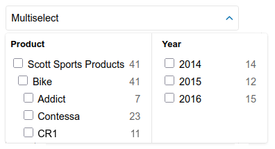
It only supports the attributes adapter, title and source, where source consumes a comma-separated list of field IDs.
<anura-multiselect adapter="some-adapter" title="Sizes", source="12,34,56"></anura-multiselect>
© brix Solutions AG