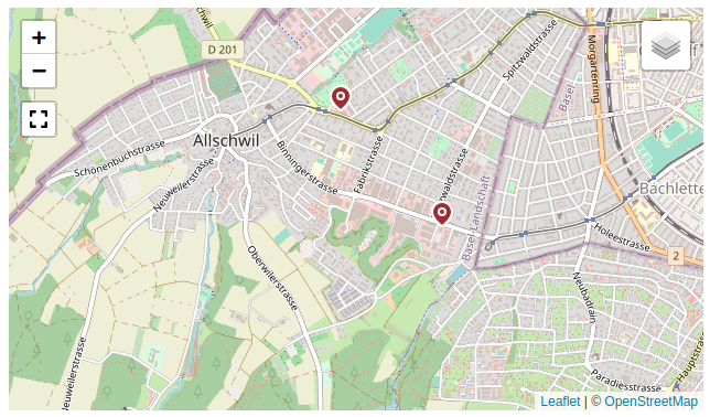
anura-map
<anura-map adapter="some-adapter" source="some-geo-field"></anura-map>
Displays a map, with geolocated assets as marker pins. This requires that your DAM has geo-capable metadata fields, in order to perform the "is in area" query (i.e. only Sharedien for now).
This component is a hybrid between a content- and a search-component, as the viewport displays assets and acts as a search source (e.g. has a value).
It is based on the wonderful leafletjs.com.
therefore, this component has dependencies on unpkg.com/leaflet* (i.e. an internet connection).
this package is not included in the
anura-componentsfile for this reason - you need to<script type="module" src="?/components/anura-map.js"></script>it separately.
Attributes
adapter
required: yes, live: no, default: -
With which adapter to talk to (for translations and suggestions)
<anura-map adapter="#my-adapter"></anura-map>
source
required: yes, live: yes, default: -
Which metadata field contains the geolocation information.
<anura-map source="my_geo_field"></anura-map>
search
required: no, live: yes, default: -
Which component the table should get its instructions from, e.g.:
anura-treeanura-searchbaranura-select
You can combine multiple search components, e.g. anura-tree,anura-searchbar, which will be ANDed together. Depending on where they live, you may use a selector such as aside > *.
<anura-map search="#my-sidebar > *></anura-map>
node
required: no, live: yes, default: -
The content of which node that the table should display. This will cause the gallery to ask its adapter for the content of said node.
<anura-map node="4123"></anura-map>
sort
Inherited, but it has no meaningful effect (because assets are displayed at their location on the map).
page-size
required: no, live: on-load, default: 50
How many assets should be displayed at once on a page. In contrast to other components, it is recommended that you set this to something big, as the map will paginate internally until all assets are loaded.
<anura-map page-size="42"></anura-map>
basket
required: no, live: yes, default: -
Where an instance of <anura-basket> can be found to collect assets in, e.g. #my-basket. Attempts auto-detection of anura-basket.
<anura-map basket="#my-basket"></anura-map>
lightbox
required: no, live: yes, default: creates one
Where an instance of <anura-lightbox> can be found to display assets in, e.g. #my-lightbox. When none is provided or detected, a "blank" lightbox will be appended to the body. This can be prevented by passing lightbox="false", in which case nothing will happen.
<anura-map lightbox="#my-lightbox"></anura-map>
center
required: no, live: yes, default:
46.801111,8.226667
What the default center of you map should be, e.g. 47.55966,7.59551
<anura-map center="47.55966,7.59551"></anura-map>
zoom
required: no, live: yes, default: 8
What the default zoom level should be (may depend on your choice of layers).
<anura-map zoom="9"></anura-map>
layers
required: no, live: yes, default: osm
What map layers should be made available for selection (comma separated). Known layers:
- osm - Open Street Map
- osm-topo - Open Street Map, topological view
- swisstopo - Official Swiss map by Swisstopo (only covers Switzerland)
- swisstopo-mono - same as above, but monochrome
- swissimage - Official Swiss satellite imagery (only covers Switzerland)
Note that Leaflet defaults to the last one to be the active one for some reason.
<anura-map layers="swisstopo,swissimage,osm"></anura-map>
fullscreen
required: no, live: on-load, default: true
Whether to offer a fullscreen button on the map.
<anura-map fullscreen="false"></anura-map>
value (read-only)
The current viewport of the map, e.g. 48.253941,4.515381x45.305803,11.942139 read as top-left x bottom-right coordinates.
Variables
--marker-fill-colorinherits from--button-color--marker-stroke-color:inherits from--button-font-color
Events
change
Regular change event, when the map viewport changes (moved, zoomed).
assets-loading
{details: {node: nodeId, search: search-terms, keepContent: bool, pageRequest: pageRequest}}
When the gallery is loading new assets, either through a node or a search request. A good time to clear counters and such.
assets-loaded
{details: {total: totalCount, assets: AnuraAsset[], pageRequest: pageRequest}}
When assets have been loaded (through whatever mechanism), informs other components (such as anura-paginator) about the total number of assets, the new assets themselves, as well as the pageRequest (contains current paging information).
asset-added
{details: {asset: assetData, adapter: adapter, dom: asset-instance}}
When an asset has been added to the map. Useful when you want to tweak something.
asset-selection
{details: selectedAssets}
When a change to the selected assets occurs and the component updates its selected attribute.
asset-details
{details: {asset: assetData}}
When an individual anura-asset has been clicked on. By default this triggers the <anura-lightbox> unless lightbox="false" is set.
Slots
-
header - the header slot will appear before the table.
-
footer - the footer slot will appear at the very end.
-
asset - configure your own asset. Default is
<anura-asset><anura-map adapter="some-adapter"> <anura-asset slot="asset" buttons="download,details"></anura-asset> </anura-map>
Parts
<div part="map"></div>© brix Solutions AG